Lottery WA Redesign
UX/UI Design
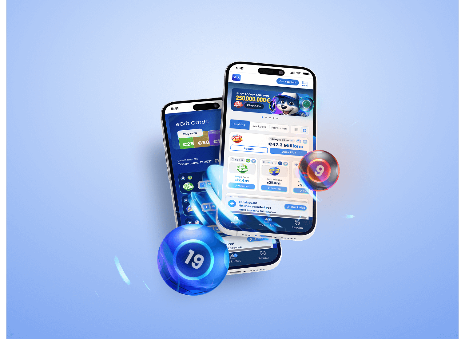
The original Lottery WA platform offered a way for users to play major international lotteries online, but the experience lacked clarity and flow. The interface required too much scrolling, the number selection process was unintuitive, and the purchase journey created confusion. As a result, users often dropped off before completing their tickets. The redesign aimed to streamline this journey, reduce friction, and create a more engaging, trustworthy experience for both new and returning players.
Client:
WA Technology
Role:
Product Designer
Year:
2024
Explore the full story ⋅
Requirement (Business problem)
The goal was to simplify the lottery-playing experience on the WA platform. The original flow had usability issues that impacted conversion rates and user retention.
Issue (User problem)
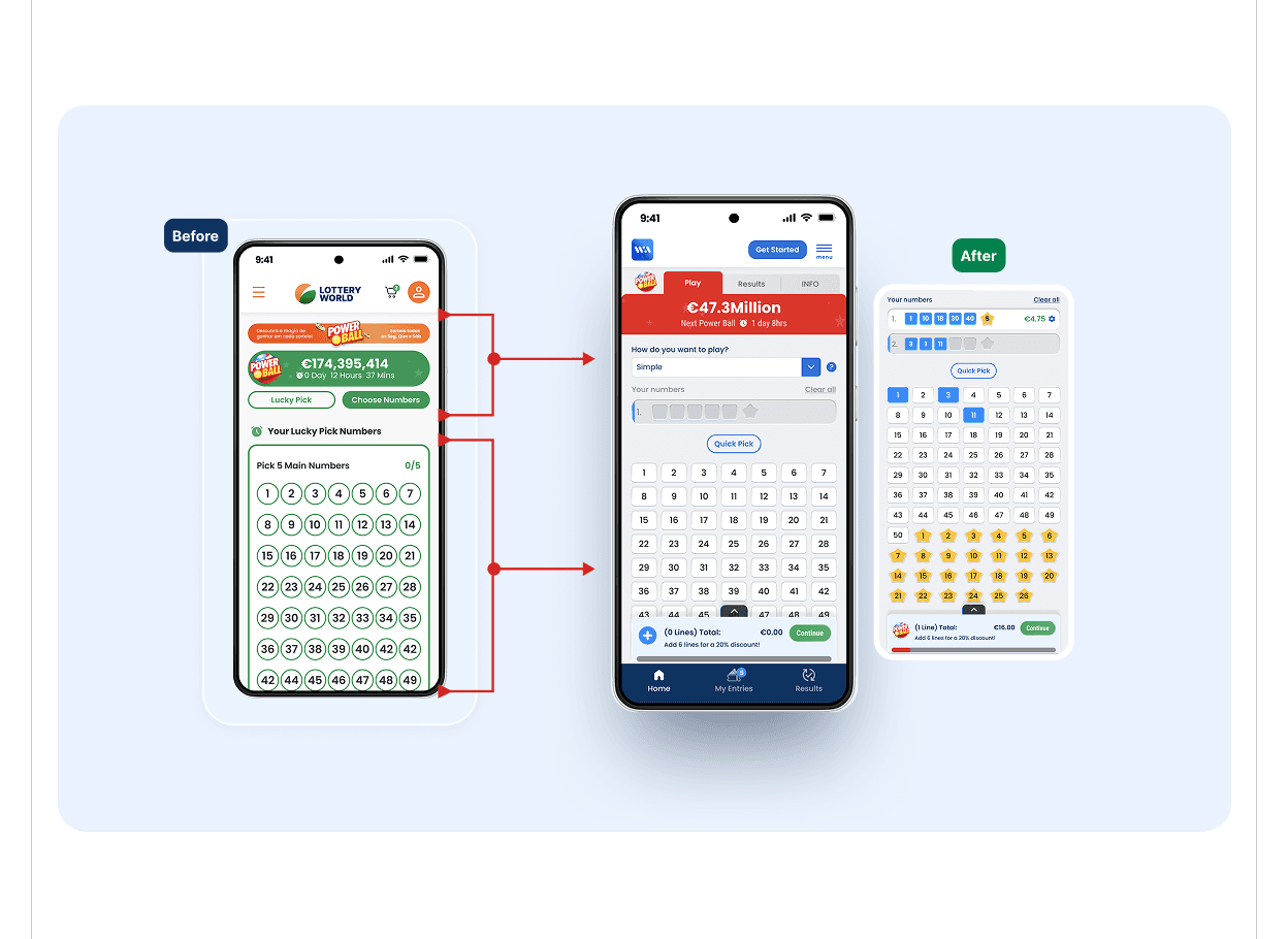
The number selection board was not compact, requiring users to scroll unnecessarily, slowing down the experience. There was also confusion between “Quick Pick” and “Choose Your Numbers.” Additionally, the payslip and payment flow lacked clarity, making it difficult for users to understand what they had selected or how to complete their purchase.
Design (Solution)
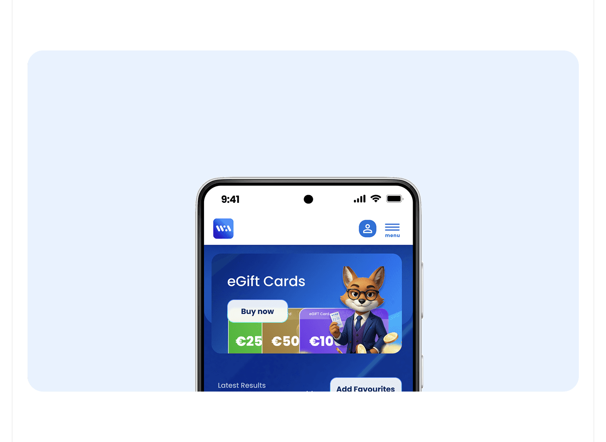
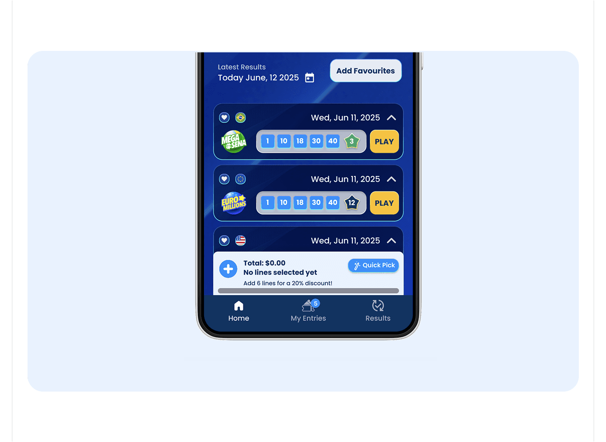
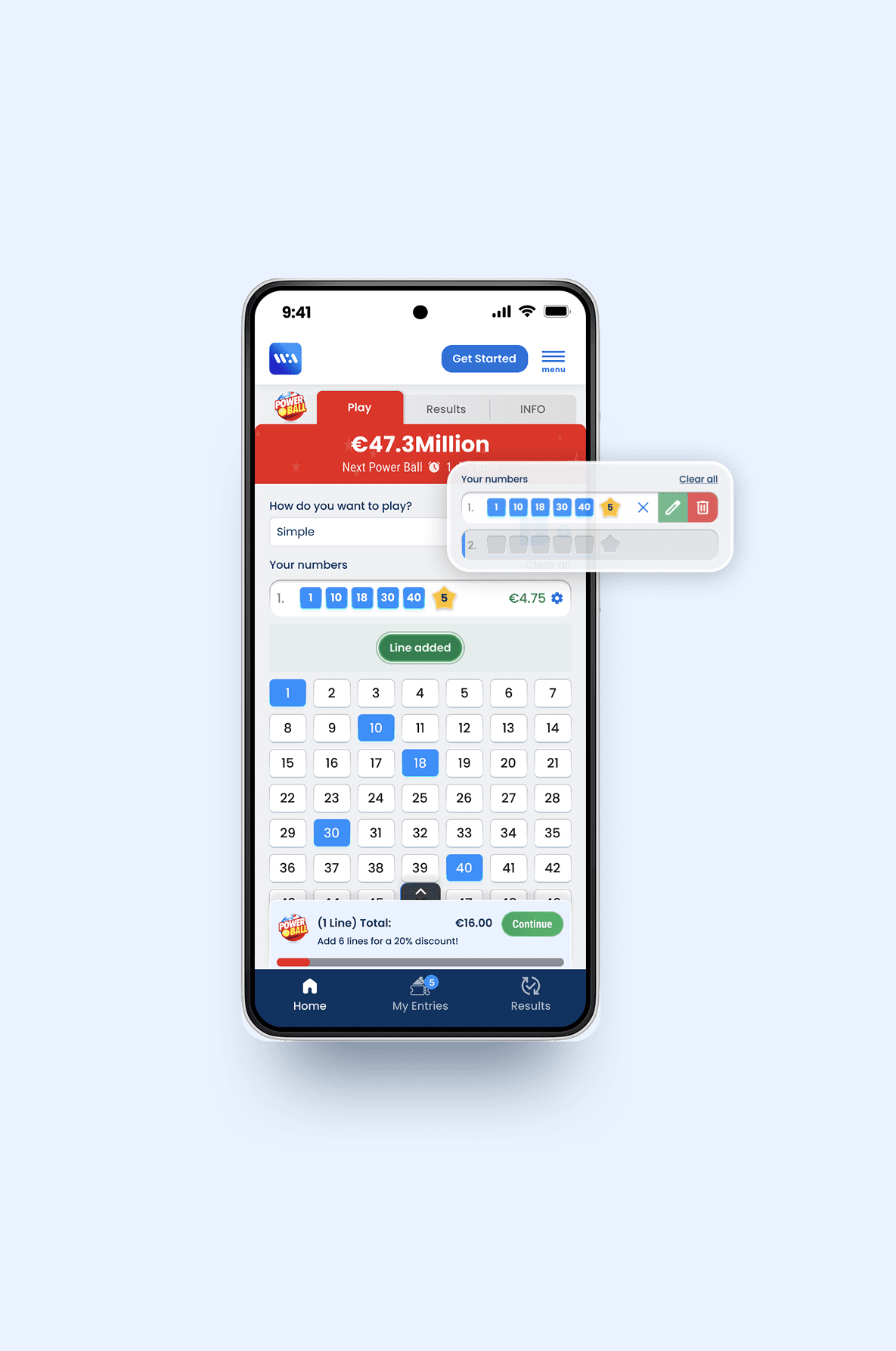
I redesigned the number selection board to be more compact and globally reusable. A prominent Quick Pick button was introduced for easier interaction. A modal selector (“How do you want to play?”) helped users choose between available modes like Simple, Multi, and Favorite. We also added a bottom modal payslip to give users a live preview of their selections, along with a more accessible payment entry point—streamlining the entire experience.
End result (Impact/Outcome)
The redesign significantly improved user interaction, reducing drop-offs and boosting conversion rates. We observed a noticeable increase in returning users and an uplift in successful plays through the app.
Lottery WA Redesign
UX/UI Design
The original Lottery WA platform offered a way for users to play major international lotteries online, but the experience lacked clarity and flow. The interface required too much scrolling, the number selection process was unintuitive, and the purchase journey created confusion. As a result, users often dropped off before completing their tickets. The redesign aimed to streamline this journey, reduce friction, and create a more engaging, trustworthy experience for both new and returning players.
Client:
WA Technology
Role:
Product Designer
Year:
2024
Explore the full story ⋅
Explore the full story ⋅
Requirement (Business problem)
The goal was to simplify the lottery-playing experience on the WA platform. The original flow had usability issues that impacted conversion rates and user retention.
Issue (User problem)
The number selection board was not compact, requiring users to scroll unnecessarily, slowing down the experience. There was also confusion between “Quick Pick” and “Choose Your Numbers.” Additionally, the payslip and payment flow lacked clarity, making it difficult for users to understand what they had selected or how to complete their purchase.
Design (Solution)
I redesigned the number selection board to be more compact and globally reusable. A prominent Quick Pick button was introduced for easier interaction. A modal selector (“How do you want to play?”) helped users choose between available modes like Simple, Multi, and Favorite. We also added a bottom modal payslip to give users a live preview of their selections, along with a more accessible payment entry point—streamlining the entire experience.
End result (Impact/Outcome)
The redesign significantly improved user interaction, reducing drop-offs and boosting conversion rates. We observed a noticeable increase in returning users and an uplift in successful plays through the app.